Exploring Chaco with IPython
Chaco has an interactive plotting mode similar to, but currently more limited than matplotlib’s. This plotting mode is also available as an Envisage plugin, and so can be made available within end-user applications that feature an Envisage-based Python prompt.
Basic Usage
To get started, you need to run iPython with the --gui=wx option enabled, so that the iPython and wx event loops interact correctly [1]
ipython --gui=wx
You could instead start in -pylab mode if you prefer, which has the advantage of pre-loading numpy and some other useful libraries. Once you have the iPython prompt, you can accesss the Chaco shell mode commands via:
In [1]: from chaco.shell import *
We’ll start by creating some data that we want to plot:
In [2]: from numpy import *
In [3]: x = linspace(-2*pi,2*pi, 100)
In [4]: y = sin(x)
In [5]: plot(x, y)
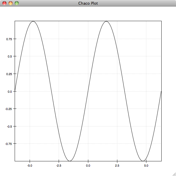
If you experiment with the plot, you’ll see that it has the standard Chaco pan and zoom tools enabled. As with Matplotlib, you can specify options for the display of the plot as additional arguments and keyword arguments to the plot command. The most important of these is is the format string argument, which resembles the Matplotlib format strings:
In [6]: plot(x, y, 'g:')
This creates a green, dotted line plot of the data. You could instead create a red scatter plot of the data with circles for markers using:
In [7]: plot(x, y, 'ro')
You’ll notice that each of these plot commands replaces the current plot with the new plot. If you want to overlay the plots, you need to instruct Chaco to hold() the plots:
In [8]: hold()
In [9]: plot(x, cos(x), 'b-')
In [10]: plot(x, sin(2*x), 'y^')
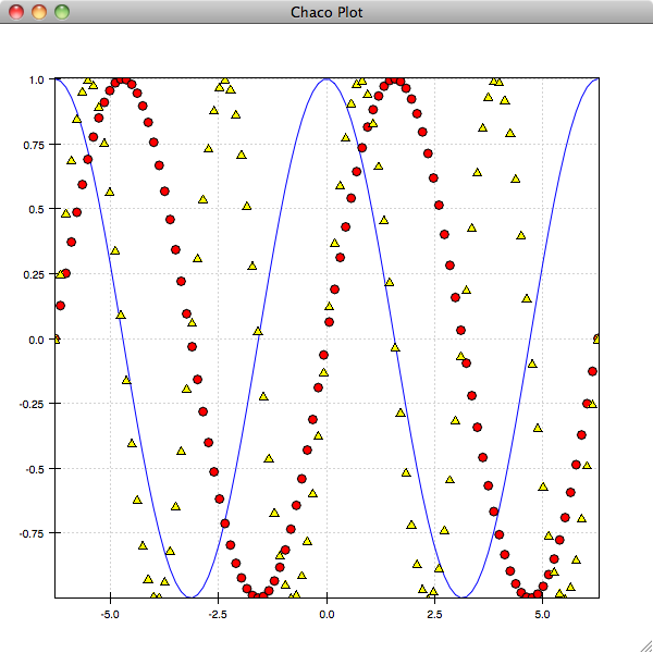
Calling hold() again will toggle back to the previous behaviour:
In [11]: hold()
You can also plot multiple curves with one plot command. The following single plot call is equivalent to the above three:
In [12]: plot(x, y, 'ro', x, cos(x), 'b-', x, sin(2*x), 'y^')
Types of Plots
The Chaco shell interface supports a subset of the standard Chaco plots. You can do line, scatter, image, pseudocolor, and contour plots.
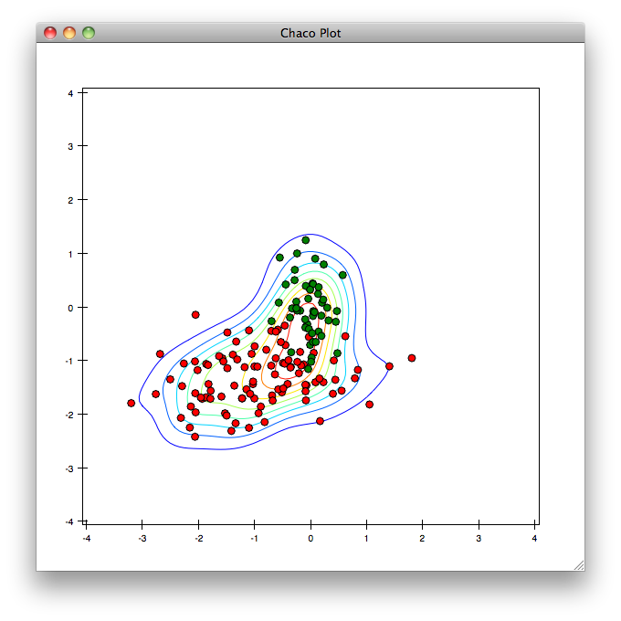
To illustrate some of these different plot types, let’s create a couple of 2D gaussians and plot them:
In [13]: x1 = random.normal(-0.5, 1., 100)
In [14]: y1 = random.normal(-1.25, 0.5, 100)
In [15]: x2 = random.normal(0 ,0.25, 50)
In [16]: y2 = random.normal(0, 0.5, 50)
In [17]: plot(x1, y1, 'ro', x2, y2, 'go')
We’ll now create a kernel density estimator for the combined data set, and plot that:
In [18]: x = concatenate((x1, x2))
In [19]: y = concatenate((y1, y2))
In [20]: dataset = array([x, y])
In [21]: import scipy.stats
In [22]: kde = scipy.stats.gaussian_kde(dataset)
Now that we have the distribution, we sample it at a bunch of points on a grid:
In [23]: xs = linspace(-4, 4, 100)
In [24]: ys = linspace(-4, 4, 100)
In [25]: xpoints, ypoints = meshgrid(xs, ys)
In [26]: points = array([xpoints.flatten(), ypoints.flatten()])
In [27]: z = kde(points)
In [28]: z.shape = (100, 100)
Finally, we can plot the contours. For grid-based plots like contours and images, we need to supply the x- and y-coordinates of the edges of the pixels, rather than the centers:
In [29]: xedges = linspace(-4.06125, 4.06125, 101)
In [30]: yedges = linspace(-4.06125, 4.06125, 101)
In [31]: hold()
In [32]: contour(xedges, yedges, z)
Other related plotting commands which are available include imshow(), contourf() and pshow(). For example:
In [33]: pshow(xedges, yedges, z)
will plot a pseudo-color image of our sampling of the KDE.
Making Things Pretty
You can add plot and axis titles to your plot easily:
In [34]: title('The Kernel Density Estimator')
In [35]: xtitle('x')
In [36]: ytitle('y')
and you can toggle whether or not grids are drawn by:
In [37]: xgrid()
In [38]: ygrid()
and similarly:
In [39]: legend()
toggles the display of the legend. These toggling commands can optionally take a boolean value which instead of toggling the display will either always show or hide the grid or legend. For example:
In [40]: legend(False)
will ensure that the legend is hidden. You can toggle the axes completely with:
In [41]: xaxis()
In [42]: yaxis()
but you can additionally gain quite fine-grained control over display of the axes by passing keyword arguments to these commands. For example, to display the y-axis on the right instead of the left, you would do:
In [43]: yaxis(orientation='right')
You can see the complete set of available keyword arguments via ipython’s help:
In [44]: yaxis?
Base Class:       <type 'function'>
String Form:   <function yaxis at 0x1e4e25f0>
Namespace:        Interactive
File:             /Users/cwebster/src/ets/chaco/enthought/chaco/shell/commands.py
Definition:       yaxis(**kwds)
Docstring:
    Configures the y-axis.

    Usage
    -----
    * ``yaxis()``: toggles the vertical axis on or off.
    * ``yaxis(**kwds)``: set parameters of the vertical axis.

    Parameters
    ----------
    title : str
        The text of the title
    title_font : KivaFont('modern 12')
        The font in which to render the title
    title_color : color ('color_name' or (red, green, blue, [alpha]) tuple)
        The color in which to render the title
    tick_weight : float
...
If you have a plot in a state that you are happy with, you can save the current image with the save() command:
In [45]: save('my_plot.png')
Log Plots and Time-Series
The Chaco ipython shell can create plots with logarithmic axes. If you know at the time that you create the plot that you want log axes, you can use one of the commands semilogx(), semilogy() or loglog() as you would the usual plot() command:
In [46]: x = linspace(0, 10, 101)
In [47]: y = exp(x**2)
In [48]: semilogy(x, y)
If you have already created a plot, and you decide that it would be clearer with a logarithmic scale on an axis, you can set this with the xscale() and yscale() commands:
In [49]: xscale('log')
You can set it back to a linear scale in the same way:
In [50]: xscale('linear')
Time axes are handled in a similar way. Chaco expects times to be represented as floating point numbers giving seconds since the epoch, the same as time.time(). Given a plot with a set of index values expressed as times in this fashion, you can specify the scale as 'time' and Chaco will display tick marks on the axis appropriately:
In [51]: x = linspace(time.time(), time.time()+7*24*60*60, 360)
In [52]: y = random.uniform(size=360)
In [53]: plot(x, y)
In [54]: xscale('time')
Plot Management
In addition to the hold() command discussed earlier, there are several commands that you can use to control the creation of new Chaco windows for plotting in to, and determining which one is currently active:
In [55]: figure('fig2', 'My Second Plot')
creates a new window with the identifier 'fig2' which will have “My Second Plot” displayed as the title of the window. Any new plots after this command will appear in this window. You can switch to an existing window using the activate() command, referring to the window either by index or name:
In [56]: activate(0)
will make the original plot window the current window, while:
In [57]: activate('fig2')
will switch back to our second window.
For advanced users, you can get a reference to the current Chaco plot object using the curplot() command. When you have this, you then have full access to the programatic Chaco plot API described elsewhere.
Finally, you can use the chaco.shell API from Python scripts instead of interactively if you prefer. In this case, because you do not have ipython around to set up the GUI mainloop with the --gui=wx option, you need to use the show() command to start the GUI mainloop and display the windows that you have created.
Footnotes
| [1] | Starting from IPython 0.12, it is possible to use the Qt backend with --gui=qt. Make sure that the environment variable QT_API is set correctly, as described here |